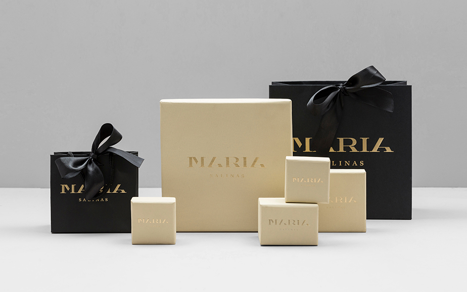
The quest to make one of the most popular names in the world stand out is quite difficult. Years in, years out I’ve looked for unique renditions of my name, Maria. This past week I came across the elegant brand identity of Maria Salinas, the Mexican jewelry designer. Maria Salinas designs custom pieces in gold and silver that is seen in the color scheme. The logo’s classic subtraction style of typography translates into concepts of quality, customization and attention to detail, similar to high-fashion branding.
Anagrama designed the branding. They are located in Monterrey, Mexico and Mexico City, Mexico. Anagrama, explained, “Black and gold create the ideal ambiance to bring out the glitz in the brand's jewelry. Since Maria Salinas offers personalized pieces where, together with the client she exchanges and sketches ideas, we integrated tangible grid patterns throughout the branding and the shop's interior design.”
Anagrama doesn’t have a public video published about their work, however Paula Scher, the principal at Pentagram, NYC office does. Scher’s work in typography has brought her to the forefront of graphic design. This video generally explains typographic logos. One of her most famous logos is the Citibank logo, which she mentions in the video as being done in one meeting. Scher has a range of clients that include The New York Times Magazine, Perry Ellis, Bloomberg, Target, Jazz at Lincoln Center, the Detroit Symphony Orchestra, the New Jersey Performing Arts Center, the New 42nd Street, the New York Botanical Garden, and The Daily Show With Jon Stewart. In 1996 Scher's widely imitated identity for the Public Theater won the coveted Beacon Award for integrated corporate design strategy. She serves on the board of The Public Theater, and is a frequent design contributor to The New York Times, GQ and other publications.


